French fold
Fenner redeem paper - 120 gsm for inside material & 240 gsm for the cover
Printed using an inkjet printer
Front cover with dust jacket
ABSTRACT
Everything in this world has a part that is always similar. For example, imagine a human being compared with a tree, just like computers are compared to humans nowadays. Almost all aspects of the natural habitats have a connection, from seed to sperm, roots to veins, skin to bark, branches to hands, and leaves to hair. And each comparison tells a story of the rise and fall of life.
Understanding the relationship between humans and nature is very important. If humans can relate to the environment, then it can lead to the development of possible solutions to the problems that occur in nature (Flint et al., 2013). As a result of this, it will help in the development of policies regarding the social-economic consequences.
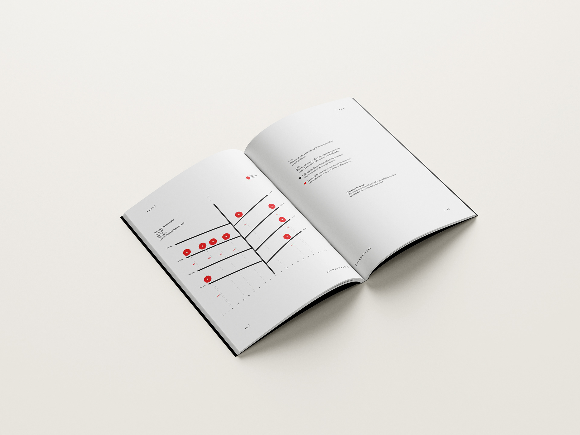
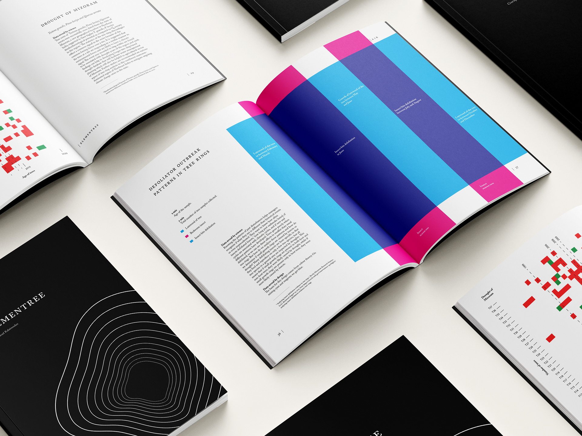
Every action has an equal and opposite reaction, says Newton in his one of the laws of motion. Humans react differently based on their emotions. Likewise, nature is also intelligent enough to respond. This project aims to find a story through the deconstruction of nature. For this purpose, a tree was used as the main subject of exploration. Graphic design plays a role in bridging the gap between science and art. With the help of the data produced by the dendrochronologists, the visuals to represent data will be constructed with the aim of finding a compound representation for the scientists and the audience.
Understanding the relationship between humans and nature is very important. If humans can relate to the environment, then it can lead to the development of possible solutions to the problems that occur in nature (Flint et al., 2013). As a result of this, it will help in the development of policies regarding the social-economic consequences.
Every action has an equal and opposite reaction, says Newton in his one of the laws of motion. Humans react differently based on their emotions. Likewise, nature is also intelligent enough to respond. This project aims to find a story through the deconstruction of nature. For this purpose, a tree was used as the main subject of exploration. Graphic design plays a role in bridging the gap between science and art. With the help of the data produced by the dendrochronologists, the visuals to represent data will be constructed with the aim of finding a compound representation for the scientists and the audience.


Adobe Caslon Pro is chosen for this book. It is a typeface which has a formal appeal with aesthetic quality. Since it is an open-type typeface, it has a wider variety of options to choose from. Ideally, a character count of 45-65 is allowed for the readability of the content (Bringhurst, 2004, p. 39). The column width in this book for each text block is 21 picas. After many trial and error, to maintain the ideal character count on a standard A4 paper, the font size of 10 is chosen. This resulted in a maximum of 61 as the number of characters per line.
Once the font size is chosen, the leading size is calculated. The leading is calculated as 120% of the font size. 90% of the leading size also helps to calculate the font size. This 10/12, i.e., ten on 12pt leading font, is used for the body copy. With this as a base, to maintain the proportion between the content, for the title, subtitle, caption, pull quotes, and references are in the ratio with the body copy. On printing this on an A4 using a canon digital printer, it produced content which is both legible and readable. For the display fonts, the leading size is reduced accordingly. Since the Caslon Pro is an open type, it has built-in small caps and ordinals/numbers to match the x-height of the body copy.
Once the font size is chosen, the leading size is calculated. The leading is calculated as 120% of the font size. 90% of the leading size also helps to calculate the font size. This 10/12, i.e., ten on 12pt leading font, is used for the body copy. With this as a base, to maintain the proportion between the content, for the title, subtitle, caption, pull quotes, and references are in the ratio with the body copy. On printing this on an A4 using a canon digital printer, it produced content which is both legible and readable. For the display fonts, the leading size is reduced accordingly. Since the Caslon Pro is an open type, it has built-in small caps and ordinals/numbers to match the x-height of the body copy.